
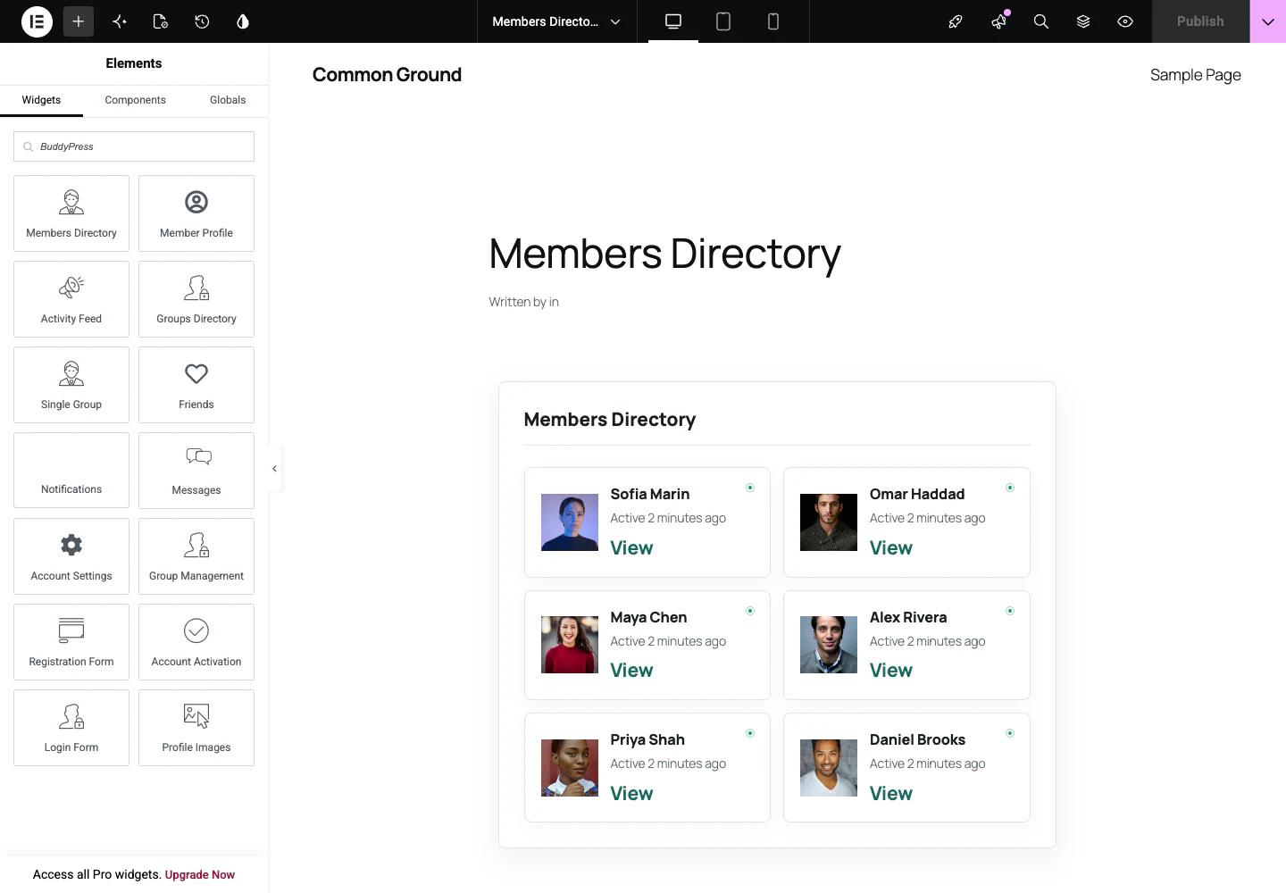
Start with a coherent preset
Choose from 24 curated design presets plus Custom. A preset changes the shared token system; it does not lock component-level controls. Use a preset as a consistent baseline, then change only the tokens that belong to the brand.
Shared tokens
- Accent, hover, surface, alternate surface, text, muted text, border, success, and danger colors
- Body and heading typography
- Container width and responsive columns
- Padding, margins, gaps, borders, radii, and shadow strength
- Avatar, cover, and image geometry
- Button treatment and reduced-motion-safe entrances
Local overrides
Every component can inherit global values or override them. Keep inheritance for routine components. Override only when information hierarchy requires a deliberate exception.